
 Lessons: 19Length: 2.4 hours
- Overview
- Transcript
5.1 Using the `BreakpointObserver`
The Material library's CDK (Component Development Kit) has a BreakpointObserver which allows us to react to different screen or window sizes. This is perfect because it'll allow us to programmatically change the behavior of our application based on the screen or window size.
1.Introduction
1.1Introduction01:23
1.2What You Need06:14
2.Getting Started
2.1Creating the Project08:21
2.2Designing the Basic Layout08:50
3.Writing the Basic Functionality
3.1Fetching the Feed List08:48
3.2Displaying the Feed List07:06
3.3Toggling the Feed List Drawer05:53
3.4Using Named Router Outlets09:22
3.5Displaying Feed Items09:11
3.6Displaying the Content12:16
4.Adding Settings
4.1Designing the Settings Panel10:03
4.2Using Services to Manage State07:13
4.3Finishing the Settings11:02
5.Managing Screen Sizes
5.1Using the `BreakpointObserver`08:03
6.Authentication and Authorization
6.1Refactoring08:24
6.2Authenticating With the Server07:58
6.3Sending the Token04:19
6.4Authorizing Routes07:05
7.Conclusion
7.1Conclusion01:06
5.1 Using the `BreakpointObserver`
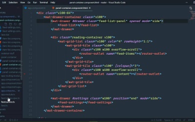
When we work with different screen sizes, we typically rely upon CSS. Because media queries make it so easy to set up breakpoints. So that we can change the style of our elements based upon the screen size. However, there are some things that just can't be done with CSS. Like, for example, let's open up the developer tools and let's click on the Toggle device toolbar so that we can resize our application. [LAUGH] And we can see that the feed this takes up an overwhelmingly large amount of the UI. Now, of course, we could hide it, and that makes that a little bit better. And you can make the argument that we just need to resize this. But really no, I mean, whenever we hide this, there's not a whole lot of screen availability here. So what we could do then is change the behavior of this side nav component, because we have this drawer here that has different modes. And we can change the mode to overlay, so that our content would be this size. And it's not perfect, but we're not going to make it perfect. We're going to rely upon some of the utilities in the CDK so that we can change the mode of our drawer. So that it will overlay itself, and it will leave the content size alone. So we just need to implement that. Let's go to our @Component, and the CDK gives us something called a breakpoint observer. Which is a really cool little utility because it allows to essentially listen for different screen sizes. And whenever our screen size reaches a certain point, it's going to fire off an event. So let's have our constructor and we're going to get our BreakpointObserver from the Angular CDK layout. And there's also another class that we want is called a Breakpoints, which allows us to specify different breakpoints. And really all we have to do is use our BreakpointObserver. We're gonna call this observe method to listen for different screen sizes. And really we only need to listen for three. So the first is going to be extra small, the second is going to be small, and then the third is going to be medium. Now we probably don't really even need Small here. Because what we're going to do is if the screen size is extra small or small, then we are going to set a property called isSmallScreen to true. But if we ever reach the medium breakpoint or we go farther or a larger size screen, then isSmallScreen is going to be set to false. So because we are observing this, this is creating an observable, we can subscribe. And our event listener is going to have the state of our breakpoint. So we could set isSmallScreen equal to, and then we're going to use our state which has a breakpoints object. And we are going to see if we have hit the extra small breakpoint, or the small breakpoint. And if we have then of course, the isSmallScreen property is going to be set to true, otherwise it will be false. And let's put this on multiple lines because that's a lot of typing. So let's just put the second half of that condition there. All right, so using this isSmallScreen, we can then pass that on down to our panels, because that is where we need to specify the mode of our feed list drawer. So first of all, inside of the template for our app component, we need to pass that isSmallScreen size. So we will essentially have the same property in our panels container isSmallScreen. And we will set that equal to isSmallScreen, so that's going to be fun. Now let's open up our panel containers code file as well, because we do need to specify that property. However, this is going to be a little bit more involved and I'll show you why here. So let's first of all have our input decorator and we're going to use a getter. So isSmallScreen, and this is of course going to be a Boolean value. And for right now, we're just going to return true. Let's write the setter for this, because this is where we are going to need to make some decisions here. So we're going to have the value coming in, which is once again, Boolean and we are going to create a property called drawerMode. And the value of this property is going to depend upon value. If it is a small screen, then drawerMode is going to be set to over, otherwise, it's going to be set to side. Now, let's go ahead and define that. And we will go ahead and give that a default value as well. That is a string and the default is side. Now, I also want to create a tracking field for the isSmallScreen, so that we can keep track of that. That is also a Boolean. We will initialize that as false, but we're going to change that value based upon whatever was supplied to our setters. So we will set its value there, and then inside of the isSmallScreen, we will return this isSmallScreen. So with that in place, we can take this drawerMode, we can go to our components template. And this is for our first drawer, this is for the feed list. So we're going to change the mode, and we're gonna bind that to our drawerMode. So with those changes and if everything is saved, then we can see that our drawer now is set to overlay. And whenever we show it, it's simply going to overlay the content. If we change the screen size, and in this case we are still considered in a small screen, but if we go to a laptop sized screen, well then the behavior changes. It goes back to that side mode that we had before. So, smaller screens have an overlay, larger screens slide everything over. Now we could essentially do the same thing for the content. Because the size of the content isn't really controlled by CSS. Instead it is controlled by the mat-grid-list component and the grid-tile components. Because if you remember, for the content, we set the column span to three. So if we wanted to, we could create two properties that would contain the column values for the item list and the content. And we could use the same principle so that if it is a small screen, then the item list would be a little larger, the content would be a little smaller. And then for larger size screens, it would go back to a one and three. So when it comes to working with different screen sizes, CSS is definitely an option. But when you're working with Angular components, utilities like the BreakpointObserver are invaluable.


