
 Lessons: 12Length: 1.4 hours
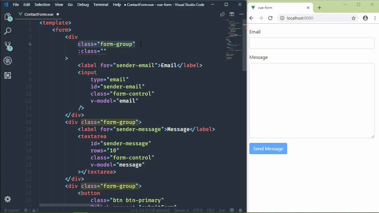
- Overview
- Transcript
4.5 Manipulating Style
Probably the most common thing we do as client-side developers to respond to user input is to manipulate the style of components. In this lesson, we'll bind CSS classes to our component data in order to manipulate our component's style.
1.Introduction
1.1Introduction01:48
2.The Obligatory "Hello World" Example
2.1Basic Structure04:55
2.2Single-File Component Structure09:51
3.The List Example
3.1Passing Props and Iterating a Collection12:41
3.2Displaying More Data08:56
3.3Using External Data11:41
4.The Contact Form Example
4.1Building the Form08:45
4.2Handling Events08:42
4.3Binding Form Controls to Component Data06:07
4.4Defining Computed Properties04:40
4.5Manipulating Style05:48
5.Conclusion
5.1Conclusion00:58
4.5 Manipulating Style
One of the most common things that we do in client-side development is manipulate style. And Vue makes it very easy to do. It follows the same ideas and concepts of just about everything else that we have done declaratively. And that is we use a directive to bind a CSS class to some component data. It's kind of like the disabled attribute that we bound to this JavaScript expression for the button. So what we're going to do then is add some CSS to denote when a form field is invalid. Because right now, it just looks like any other form field. And we're going to do this at the form-group level. So it's going to be for the div element. This way, we can just add in that CSS class. We'll call it invalid-field. And then we can style the label. We can also style the form-control. So let's go ahead and let's add that CSS. And we will start by adding a border, or changing the border color, of our form-control. Our selector is going to be .invalid-field, followed by .form-control. And we are going to change the border color to a reddish color. It's from the Bootstrap sets of colors. And we can also change the border width. Because as we save this and we see the red border, right, we can see that there was a change, but I would like something a little bit more substantial. So let's set the border width to 2px. It might be a little bit too much, but I think that's going to be okay. Now for the label, our selector will be .invalid-field followed by the label. And let's set the color to that same red value. Let's also set the font weight to bold, that way it sticks out. And so it's very apparent that there is something wrong here. So now that we have our class set up, all we need to do then is bind that class to our component data. And since this is for validating the email field, all we need to do is bind it to all that isEmailValid computed property that we created in the previous lesson. So this is what it's going to look like. We have our normal HTML class attribute. We're going to follow that up with a v-bind class. So it would look like this, but we're, of course, going to use the shortened syntax. So even though we already have a class attribute, this is perfectly valid. This class attribute will always be there. We will always have the form-group class applied to this div element. But since we are binding other classes using v-bind, that is going to allow us to bind CSS classes to an expression. So the syntax uses an object. The property names are the names of the CSS class that we want to toggle on and off. The values for those properties is true and false. It's going to be bound to the isEmailValid. So it's going to look like this. We have a CSS class that has a hyphen. So we can't just directly say invalid-field, that's not valid JavaScript. Because remember that we are switching into JavaScript mode whenever we are using a directive. So our property, then, is the string value of invalid-field. And we are going to turn that on when isEmailValid is false. But of course, we need to reverse that, so that when it's false, that this is actually true. What I would like to do is rename this to isEmailInvalid. Because when it comes to having checks, I like to have the truthy value. But since we've already written it and we've already done it, we're just gonna leave this alone. So whenever I save this, we should see our email field become invalid because we don't have anything. But the moment we add in a valid email, everything clears out and we're good to go. So now we all just need to do the same thing for the message. And I'm just going to grab this entire opening div tag and I'm going to replace the one for message. We need to change our check here for message, which seems a little, not excessive, but, I mean, all we have to do is just enter one character and it's done. So one thing we could do, then, is it's an invalid field if the length is less than 5. That's still way too few. So I don't really know what would be the best approach there. I guess we'll just stick with checking if we have a message or not. And if so, then great, if not, then whatever. So now if we type in a valid email address, our email is valid. If we type in anything in the message, we can see that we now have all of our validation errors gone and we can submit the form. So changing style in our Vue components really follows the same concepts that we have been talking about thus far. We just bind CSS classes to our component data to toggle that class.


