
 Lessons: 9Length: 55 minutes
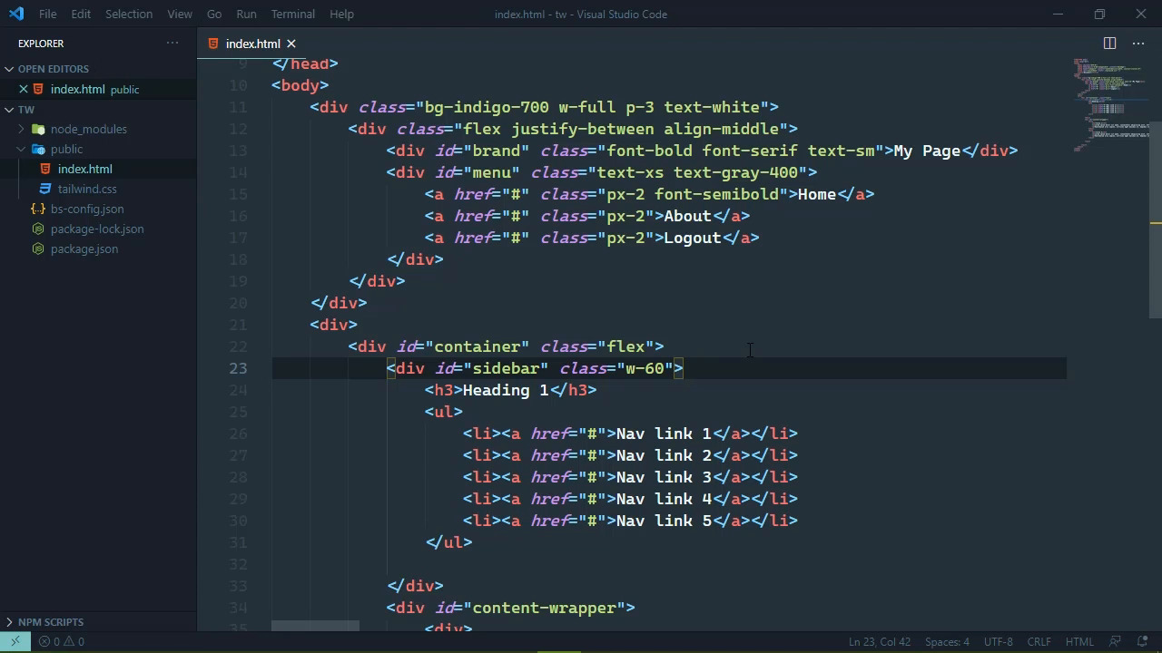
- Overview
- Transcript
2.4 Practicing More Typography
Tailwind is a framework, and just like all other frameworks—regardless of language or platform—we need to practice using it.
2.4 Practicing More Typography
In this session we are going to add some content to our page and we aren't going to focus on anything specific as far as concepts are concerned. Instead of, we are just going to use some of the classes that we have used thus far, as well as incorporate some other but similar classes. So that we can start to just practice because after all, tailwind is a framework and just like any other framework, it takes practice in order to get an idea of what and how we need to apply classes to our page. So what I want to do is kind of replicate the tailwind documentation. So that at the top, there's this navigation, and then beneath that we have our content. And the content is really divided into two parts. There's some more navigation on the left hand side, notice that it is independently scrollable. And then we have the content on the right and that is also independently scrollable as well. So that's the kind of idea that I want to run with. So we are going to add a div element that is going to contain the rest of the page. And then inside of here we will have a container. That will contain the sidebar and the content. So let's go ahead and define those. And these are just going to have IDs so that it makes it easier for me to identify the elements that we need to modify. That's basically all it is. So just like the brand and the menu IDs, we are not going to be using these for styling purposes, and we'll call this content wrapper. All right, so we want these side by side. So we know that we need to do something as far as changing the display and flex will let us do that. So, we'll go ahead and set flex on the container and then we just need some content now for our sidebar. We will start with a heading. So we'll have a group of links that have a heading. We'll just have heading 1, and then we will have an unordered list that has just a bunch of links in and in fact, let's just go ahead and copy one of the links from our menu. Let's paste that in. I don't know if we want that padding or not. So we'll just remove it and if we need to add it, then we can do that. As far as the text. Let's just have nav link 1. And then let's copy and paste a few times so that we have a few links here. Let's also change the text just so that we can see that we have different links. Now as far as our actual content. What we will do is have different sections and each section will be contained inside of a div so that each section will then have like an h2 element, which would be the title of that section. And then we would just have some content and I am just going to paste in some lorem ipsum, because why not? Now I want to multiple sections here so that we can properly style them. So let's have at least two. So let's just copy and paste. We'll change the titles so that we have two different titles. And there we go, that looks absolutely horrible. All right, so we need some definition here. We have flexbox being assigned to the container. So for our sidebar, let's go ahead and define the width here. Now we know that things regarding width pretty much start with w because we used w full in our nav bar, but we don't want this to be full. That stretches across the entire available space. Instead we want some definition here, and I'm gonna use the value of 60. Now this is not 60 pixels. Pixels are not used as a unit for really anything in tailwind, just about everything uses rem. So we can see that w-60 is a the width of 15rem, that's going to be fine. So we will apply that to the sidebar. Now, for our content wrapper. If we go ahead and save this, then, well, that still doesn't look very good, does it? Well, let's go to our content wrapper. And let's apply w-full that shouldn't make the content use the available space and, sure enough it does. Now I do want to add some padding to the container because I want everything lined up with our navbar, we do have some padding for the navbar. So all we really need to do is copy that same padding which was the third level of padding. So we will just add that to our container. Then everything will line up nice and neat there. Now I want to do a little bit with the contents because everything is just kind of jammed together and I want some delineation between these different content sections. Now, admittedly most of the delineation will come in the next lesson when we talk more about just layout oriented things. But there are some typography things that we can do such as adding a different size for the h2 elements. So, let's start with our titles here. Let's set the text to be a larger size. And let's go with an extra large size. I think if we go anything larger than that, it's just going to be overwhelming. And that is better but it still kind of gets lost with everything else. So let's add in some weight here, now I don't want to do just bold, let's do extra bold and I think that, that is going to stand out and sure enough that does. Let's go ahead and apply the same styles to the other title and that still doesn't look great, but in the next lesson we will fix that. Let's also do something for our navigation in the sidebar so that we add, at least let's do some font weight. So let's make the heading bold. And let's also transform it so that it is all uppercase. Now, this is a class that doesn't begin with text instead, the class that we would want to use. Is essentially the text transforms property value that we would want to use, such as uppercase, or if we wanted it to be lowercase, we could use that. But we want uppercase. So let's use that. And that's okay, let's change the color here. So that's we will have a gray color. Let's make it a 700 as far as the shade and let's apply the text gray class to our nav links, but let's make this a lighter gray such as maybe 500, let's first of all see what that's going to look like and that's okay. It could probably be darker. But let's just go ahead and apply that to all of the other nav links. So that's we can see that's being done and that is looking better. And in the next lesson we will talk more about layout. Now we have used some layout oriented classes so far such as padding as well as the flats class, but we will do more with padding. We will also talk about margins and borders as well as other display values.


