
 Lessons: 15Length: 1.5 hours
- Overview
- Transcript
4.3 Responsive Design
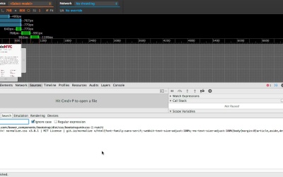
The new Responsive Mode feature is making its way into DevTools. It extends upon the Emulation Panel which we saw earlier.
Related Links1.Introduction
1.1Introduction02:45
2.Development Workflow
2.1Elements10:58
2.2Sources and CSS06:26
2.3Sources and JavaScript07:55
2.4Console06:12
3.Performance
3.1Network06:28
3.2Timeline07:13
3.3Profiles04:38
3.4Layers and Rendering10:08
3.5Audits04:07
4.DevTools and Mobile
4.1Emulation03:23
4.2Remote Debugging06:41
4.3Responsive Design05:21
5.The Resources Panel
5.1Resources02:31
6.Conclusion
6.1Extensions and Conclusion05:57
4.3 Responsive Design
Hey, welcome back. In this lesson we're going to take a look at the new responsive design mode this was a feature announced recently and, it's probably still in development, so features may change but hopefully for the most part it will stay the same so let's get straight into it. I've opened up the developer tools, and as you can see in the top left corner, i've got this little devices icon and that will toggle emulation. So I click it, and as you can see, the page suddenly looks a lot different to what it used to our page has kind of shrunk in size and in the back we've got this sort of blueprint. Take note that on the top and left hand side, there are rulers. Again, don't forget this is all entirely aimed at responsive design and how to properly test your web pages for mobile. Let's take a look at the new features of this gives us. In the top, we've got these device presets. I should say that you'll find a lot of similarity between this, and the emulation pane that we covered in one of the earlier lessons. Chances are that the emulation panel, in this emulation mode will slowly mix into one but right now they seem to happily coexist. So again we've got a bunch of device preset. I think a few new ones, have been added like these notebooks so we can select one of these and the page will update in real time. Right below those device presets, we have the ability to edit these values in real time. So,i can join up to 50, or 500. This trap box allows us to toggle the emulation of the screen resolution. So I can track that long enough. Because remember, you don't have to use a device preset, you can control each of these settings individually. We've also got the ability to swap dimensions right here, and we can also control the device pixel ratio, which is pretty cool for testing that your assets will work while on retina, for example. And finally, we have the ability to toggle the fitting, of the screen to the available screen space. Now this is all good, but again, we've had access to these before in the emulation panel. Right now, all that's happened is it basically moved into a different area of the def source. But there are a few new features, the first of which is the media query inspector, we can get to that by clicking right here and maybe you can guess what these are showing us. These are showing us the break points that the, currently inspected page has registered. And I don't know about you, but I think this feature's great cause in a number of occasions I've wanted to know what CSS media query break point. Points have I put into my CSS files, but here's where it gets even better we can even click on each of these to actually trigger the appropriate break point. So, this makes testing, for all the break points that you've registered, really quick and really easy and don't forget when you trigger these, these will also reflect in the styles pane at the bottom here. Now what if we want to find the place where these media queries were registered? Well let's try and do that, i'll make the dev tools a bit bigger we can see that that there's a media query break point here of 991 pixels so go to sources panel, close that, command auto F and do a search for 991`pixels. Okay. It looks like Bootstrap has actually [UNKNOWN] these break points so click here and this isn't too useful cause it's all amenified so I'll pretty print that. And cool. I'm taken straight to the point where that media query breakpoint was registered however, there is an easier way to do this. So, make the DevTools a bit smaller, close that drawer. If we right click on these breakpoints we can select Reveal in Source Code. You can actually select the various places where this appears, so I'll select one. We can even select another, and that works just as you would expect I'm gonna go to the Network panel now, because I want to show you another brand new feature of the simulation mode. And this is the throttling feature. In the past, to check my pages worked well on what would typically be a mobile connection speed I would use a tool called Charles Proxy to throttle my fast network connection to suddenly come out a lot slower. Now for the first time, Death Tours has the support [UNKNOWN]. So we can select the structure right here. And as you can see, we've got a bunch of pre-sets and hovering over a connection speed gives you information about the through put. So I'll select GPRS, and I'll hit Command+R3 to refresh the page. [BLANK_AUDIO] I can definitely see things are taking a lot longer. Check this out. It took like five seconds. And just to confirm that it's working, if I clear that, and select No throttling, refresh the page, okay this definitely took a lot quicker. So, throttling is a new feature of the [UNKNOWN] tools and it just works. I would really recommend that you try throttling your network connection and test your pages to make sure they load in an acceptable manner. It's understandable that things will be slower, of course, but where possible you want to try to avoid showing nothing but a white screen to your user. Consider prioritizing the content that will typically be visible in the initial viewport load and delaying the download of external resources for later. Okay, so let's recap. I'm gonna close this feature. Close the dev tools. We're at our page and open up the dev tools and we want to use emulation mode. So we click right here. And suddenly the whole page changes. We've got these sliders that we can use to see how our page responds, and we've got this media query inspector which we can toggle on and off right here. Each of these media query break points can be clicked on to essentially trigger them and you can also right click and select reveal in source code, to find the place in code where it was set. You've got the usual device presets that we learned about in emulation panel lesson. And you can edit these values manually, and get a real time update. We have the ability to throttle our network connection, which is really recommended to make sure that your pages is, behave in an acceptable manner. And finally, one thing I didn't mention is you. You can click on these three dots, and that will open up the emulation panel which we have seen already. And, as you can see, the features you already know are still present, they haven't gone anywhere. But, again, in time these might merge into one. And so that is the emulation mode. I hope you found it interesting, and check it out and see what you think. See you later.


